case study:
graphic
design
Challenges:
No existing re-brand style guide to ensure visual consistency
Fiercely competitive post-legalization market crowded with new entrants
Absence of a wholesale catalog to pitch products to retail partners
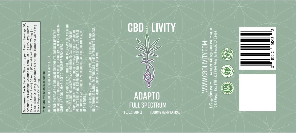
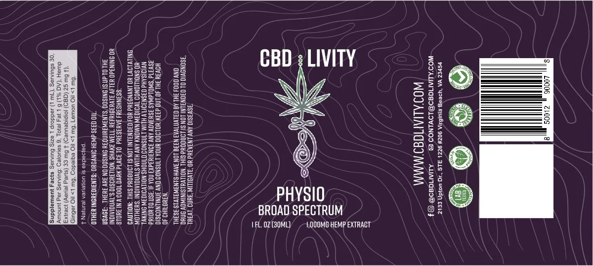
Launch of new product lines requiring distinct yet cohesive packaging
PROBLEM:
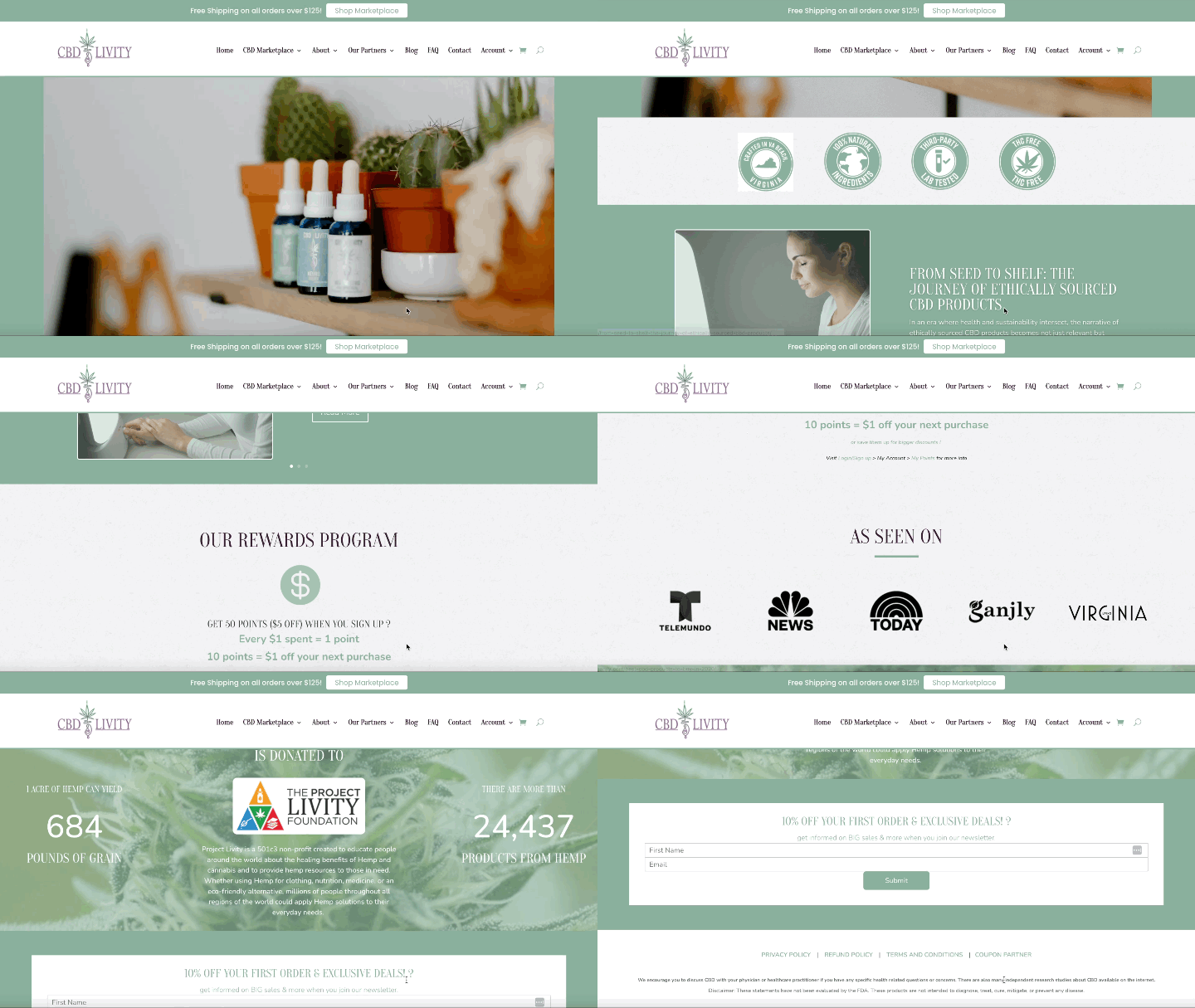
A leading national cannabis company sought to reposition its flagship product for the health-and-wellness market. They needed a fresh, natural aesthetic that would resonate with wellness-minded consumers and communicate a holistic, plant-based ethos.
SOLUTION
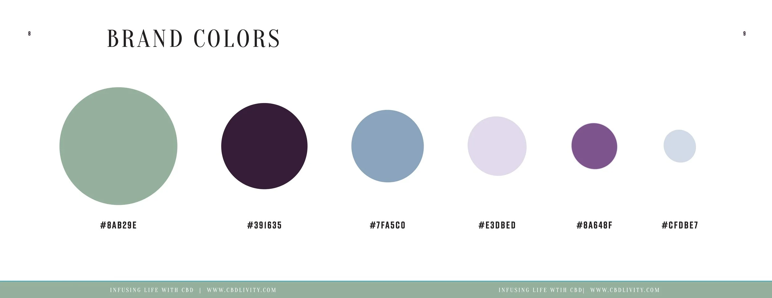
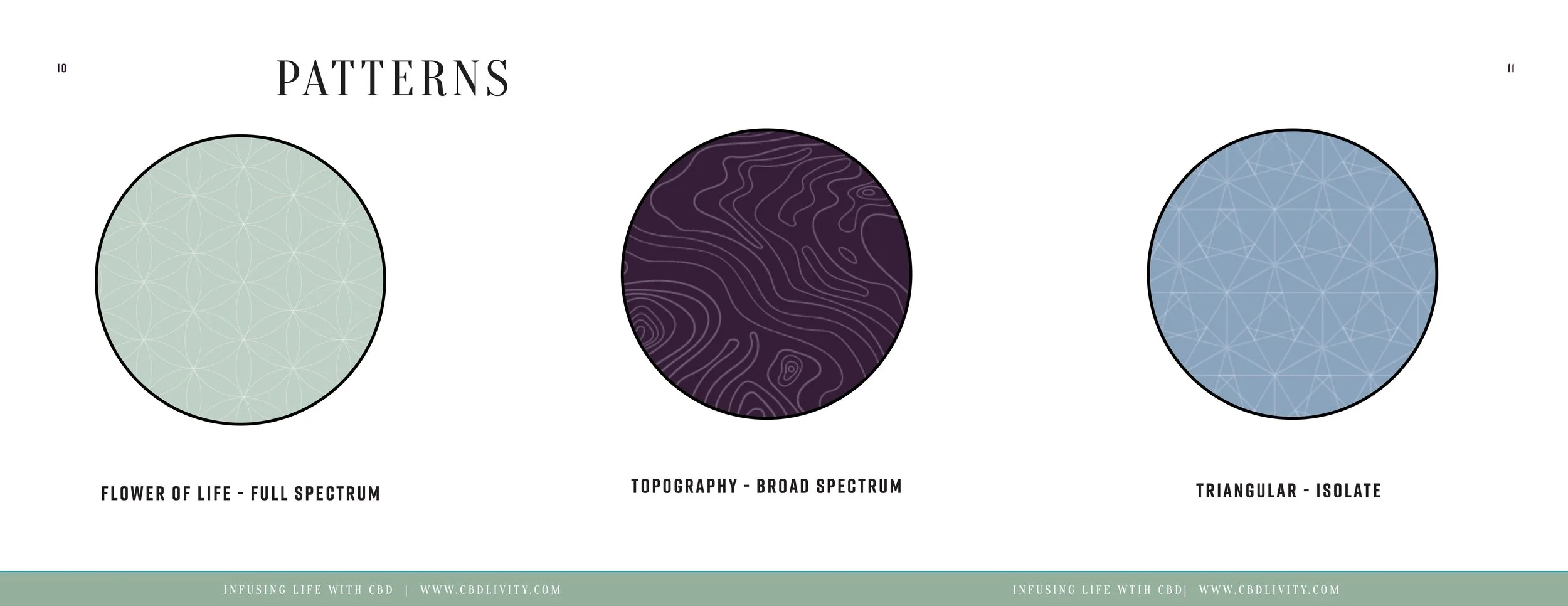
Brand Identity & Style Guide - Defined a serene, nature-inspired palette anchored by sage green. Established typography, iconography, and usage rules for print and digital.
Packaging Design in Adobe InDesign - Created unified label templates for multiple product lines (oils, edibles, topicals). Balanced clean layouts with botanical imagery to underscore purity and wellness.
Wholesale Catalog Development - Designed a branded guide with product specs, pricing tiers, and high-quality mockups. Streamlined vendor onboarding by presenting a polished, professional portfolio.
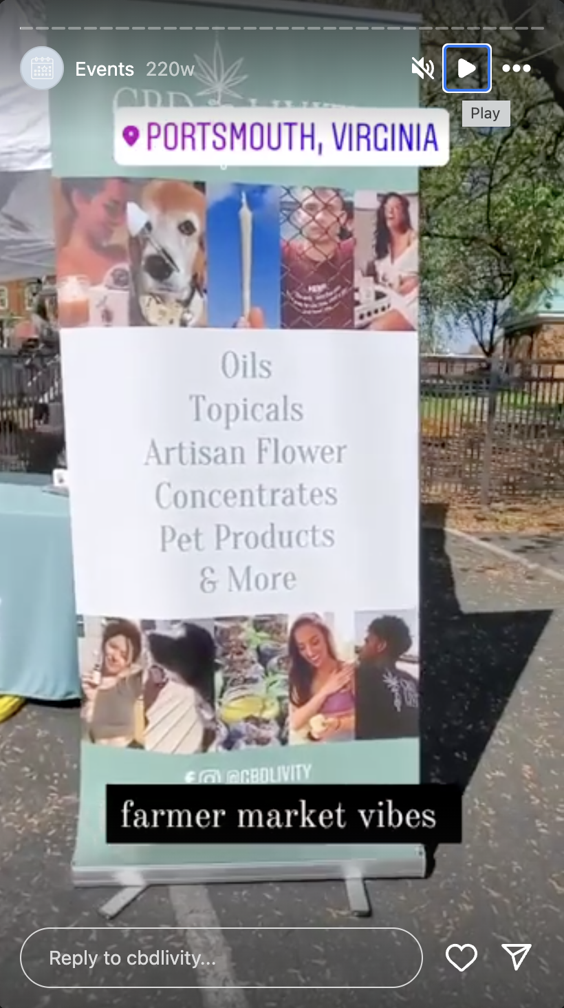
Marketing Collateral for Events - Produced infographics, brochures, retractable banner flags, and custom tablecloths. Ensured on-site visibility and a cohesive brand experience at expos and pop-ups.

RESULTS:
Sales and inquiry volume jumped by over 75% in the quarter following launch.
Brand perception shifted decisively toward health and wellness, thanks to the sage green–led redesign.
In-person event revenue climbed 30% year-over-year after introducing cohesive promotional materials.
Project Date
AUG 2020 - DEC 2020
